A powerful project dashboard transforms how you manage work through real-time analytics and data visualization. Your morning begins with a ritual in traditional construction reporting. You open the progress spreadsheet, the procurement report, the issue log from the site office, and five different email threads. You are the human integration engine, trying to stitch together a coherent picture of your project from a dozen disconnected fragments.
For most Project Managers, the first hour of the day is a frantic exercise in digital archaeology. Traditional construction reporting methods mean you’re digging through procurement reports, cross-referencing them with progress updates from contractors, and trying to reconcile both with the latest issue log from the site office. By the time you’ve pieced together this fragmented mosaic using outdated data visualization tools, the picture is already out of date. You’re constantly making critical decisions based on yesterday’s reality.
This isn’t project management, it’s project forensics.
What if you could replace that entire, stressful process with a single glance at a single screen? What if you could have a live, 360-degree view of your entire project, updated in real-time, waiting for you the moment you log in?
This is the power of a true, interactive project dashboard. In this feature overview, we will show you how the Cable Pilot dashboard moves beyond simple charts and graphs to become your project’s command center—a dynamic, analytical tool that gives you not just data, but intelligence.
Project Dashboard: From Fragmented Data to a Single Source of Intelligence
The fundamental purpose of a dashboard is aggregation. It pulls data from every corner of your project’s digital ecosystem—from the installer’s mobile app, the engineer’s design updates, the procurement team’s delivery schedules—and synthesizes it into a single, cohesive view.
- The Old Way: You hunt for information. You are the integration engine, manually connecting the dots between siloed reports.
- The New Way: The information comes to you. The dashboard is the integration engine, automatically connecting the dots and presenting you with a complete, holistic picture.

This shift from manual assembly to automated aggregation is what gives you back your most valuable asset: time to think, analyze, and lead.
Project Dashboard Anatomy: The Key Widgets
A powerful dashboard is not a static, one-size-fits-all report. It is a flexible, customizable workspace composed of individual widgets. Each widget is a dedicated window into a specific aspect of your project, designed to answer a critical business question. And because no two projects are identical, you can configure your own dashboard, choosing the widgets that matter most to you and your role.
Let’s explore the key widgets that form the core of a Project Manager’s command center.
1. The Overall Progress Widget
- The Question it Answers: “Are we on track, and is our progress real?”
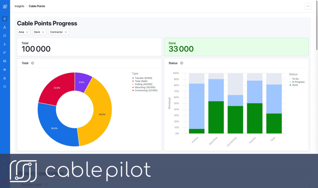
- How it Works: This isn’t just a simple “percentage complete” bar. This widget tracks progress based on the objective workload metric of Cable Points (CP). It shows you what percentage of the total budgeted effort has been completed. This is the most honest measure of your project’s health, immune to the “illusion of progress” created by counting easy tasks first.
2. The Progress by Zone / Area Widget
- The Question it Answers: “Where are we strong, and where are we falling behind?”
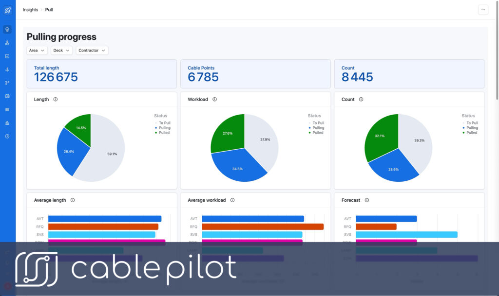
- How it Works: This widget acts as a “heat map” of your project. It visualizes the completion percentage (in CP) for each major physical area of the vessel (e.g., Engine Room, Accommodation Decks, Bridge). At a glance, you can see the “green zones” that are ahead of schedule and, more importantly, the “red zones” that represent the biggest risks to your timeline.

3. The Progress by System Widget
- The Question it Answers: “Which functional systems are ready for testing and commissioning?”
- How it Works: This widget group progresses not by physical location, but by logical function (e.g., Navigation System, Power Distribution, Fire Alarm System). This view is critical for planning the later stages of the project, as it tells you which systems are approaching completion and will soon require testing and integration.
4. The Critical Blockers Widget
- The Question it Answers: “What are the most urgent problems that are actively stopping my project right now?”
- How it Works: This widget acts as your project’s “early warning system.” It doesn’t just show you a list of all problems; it intelligently filters for the issues that are most critical—blockers with a “High” priority, issues that have been unresolved for too long, or problems that are impacting a high volume of work. This ensures your attention is always focused on the most significant threats.
From “What?” to “Why?”: The Power of Interactive Analysis
A static dashboard that only shows you what is happening is just a prettier report. The true power of a command center lies in its ability to help you understand why it’s happening. This is achieved through interactive drill-down capabilities.
Let’s walk through a real-world scenario:
1. The Observation (The “What”):
A Project Manager logs in and immediately sees a problem on his dashboard. The “Progress by System” widget shows that the “Navigation System” is highlighted in red, with only 20% of its workload complete, far behind the project’s overall average.
2. The Analysis (The “Drill-Down”):
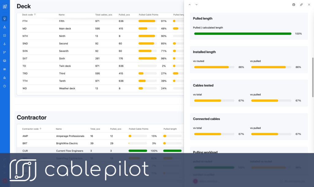
He doesn’t need to call a meeting or send an email to investigate. He simply clicks on the “Navigation System” slice of the pie chart. The dashboard instantly transitions to a detailed view, showing a list of all the equipment and cables that make up that system.
3. The Root Cause (The “Why”):
Scanning the list, he immediately spots the issue. A key piece of equipment, the main navigational radar (EQ-NAV-001), has a bright red “Blocker” icon next to it. He clicks the icon and sees the details: “Status: Delivery Delayed. New ETA: 3 weeks. Supplier: Global Marine Tech.”
In less than 30 seconds, the Project Manager has gone from a high-level strategic concern (“Why is our navigation system behind?”) to a precise, tactical root cause (“Our primary radar is delayed by three weeks.”). He can now take immediate, targeted action—contacting the procurement team to escalate with the supplier or to find an alternative—before the problem has a chance to fester for another week. This 30-second analysis just saved the project weeks of potential delays and thousands of dollars in associated costs.

Conclusion: Your Navigational Instrument
Your project dashboard is more than just a reporting tool. It is your primary navigational instrument. It shows you not only where you are at this exact moment but also where you are heading, allowing you to steer around obstacles instead of just reporting on the collision. It highlights the clear waters of on-schedule systems and the dangerous reefs of emerging bottlenecks.
By consolidating all project data into a single, live, and interactive command center, it frees you from the drudgery of data assembly and empowers you to do what you do best: analyze, strategize, and lead your project to a successful and profitable completion.
Stop managing from the rearview mirror. Request a personalized demo and we’ll show you how a live command center can be configured to solve your project’s specific challenges.
